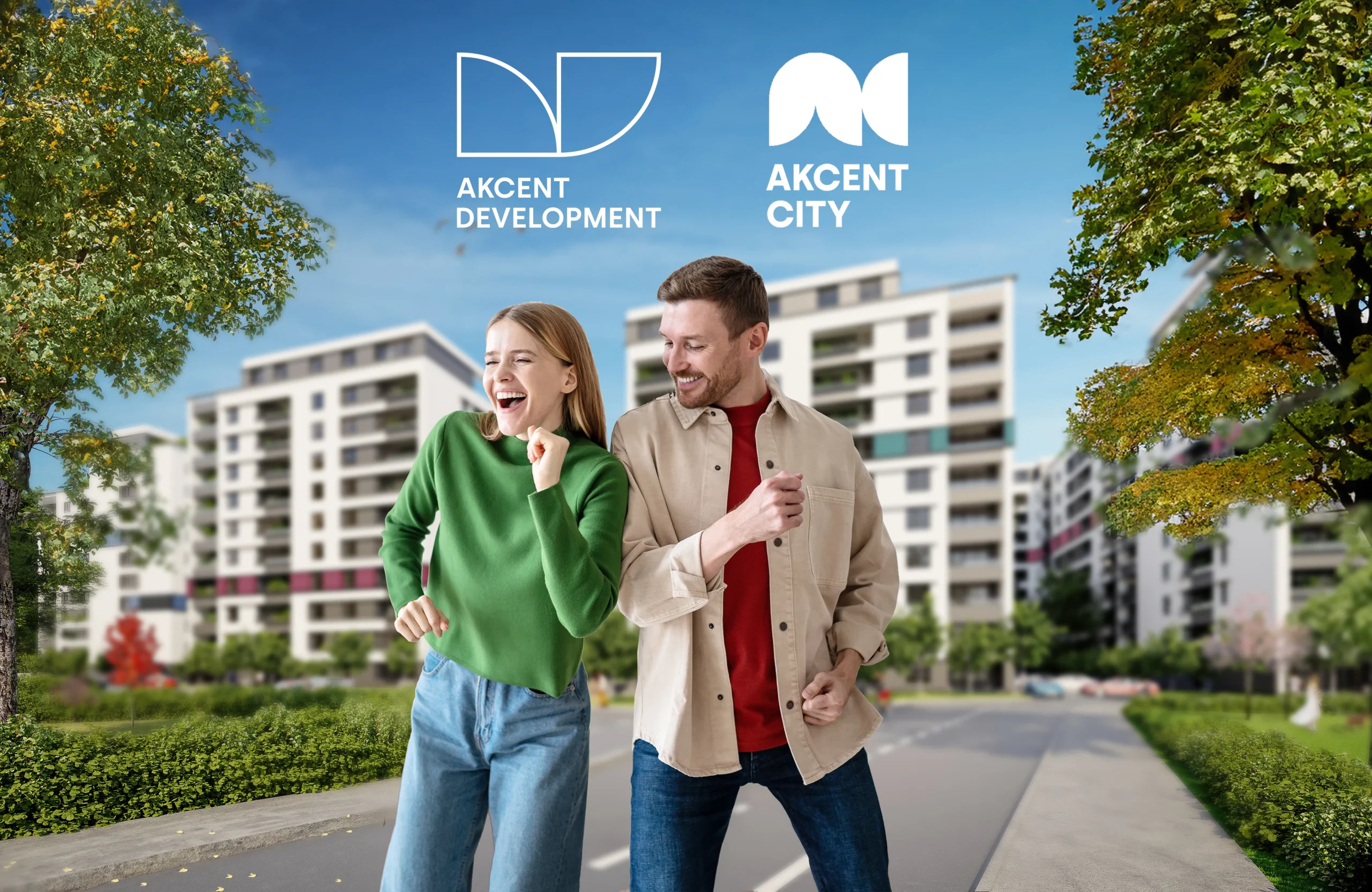
The Akcent City brand was born as a sub-brand of the Akcent Development company, with the aim of creating a residential complex that not only offers modern housing, but also represents a lifestyle. Akcent City is a place where architectural and brand design meet in a harmonious way, bringing aesthetics and functionality together.
From the beginning, we wanted to create a visual continuity between Akcent Development and Akcent City, so that the brand is recognizable, but at the same time brings an identity of its own. The central element, those disc sectors that symbolize “open doors”, has been reimagined to create the “AC” monogram of the Akcent City brand. These discs are not just an abstract symbol – they convey the idea of opportunity, affordability and an open future, exactly what a future homeowner wants when investing in a new home.
Visual unity and flexibility that inspire confidence
The disc sector thus became the building unit of the entire brand system of Akcent. This simple but meaningful geometric shape allowed for the creation of diverse visual images that reflect both sophistication and accessibility. Thus, the future owner not only invests in a home, but also in a lifestyle that can be customized according to preferences, whether he tends towards minimalist modernism or dreams of a comfortable and welcoming space.
Chromatics inspired by architecture: How it transforms a simple ensemble into a “home”
Colors play a central role in the visual and emotional experience of the future owner. The color palette of the Akcent City brand was inspired by the architectural renderings of the complex, where each building has a distinct colored band. This use of colors is not accidental – they create a sense of diversity and individuality, but also a visual balance in the whole ensemble.
Integrating these colors into the logo and brand identity was an essential decision. When a potential customer looks at these colors, they are not just part of the decor – they evoke emotions. Blue can bring a sense of calm and stability, green suggests freshness and closeness to nature, and warm shades of orange or yellow can provide a feeling of comfort and warmth. Practically, Akcent City’s chromaticity not only reflects the architecture of the ensemble, but also enriches the sensory experience of the future owner, making him feel that he has found “home”.
What does this branding mean for the future owner?
A customer who chooses Akcent City is not just buying a home – he is buying an experience. Smart design, well-thought-out colors and subtle brand messages create a strong emotional connection with the space. Every detail of the branding has been created to inspire confidence, provide the security of a solid investment and transform the home into a space where you feel comfortable, safe and happy.
Akcent City’s visual identity manages to capture the essence of a modern lifestyle – a place that is diverse, accessible and above all, warm. The brand manages to offer a personalized experience for each customer, harmoniously integrating architectural modernism with the emotion of a “home”.
Article made together with the Digital Partners team.

